

Introduction to key topics in Capturi
This guides give you a step by step breakdown of the user interface on the key topics page, and help you understand how to use and navigate the functionality.
The donut chart
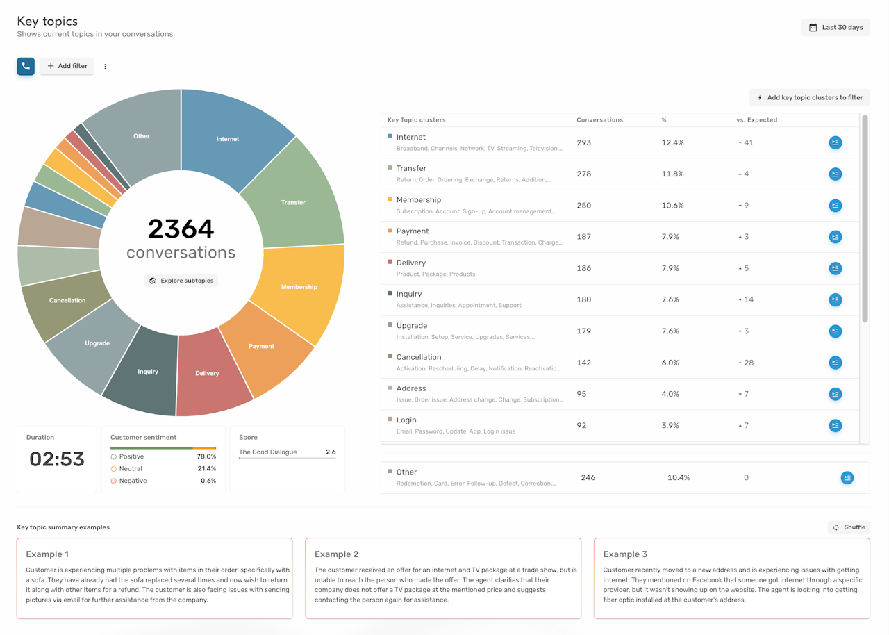
The donut chart (or sunburst chart) consist of two levels:
Level 1 - The key topic clusters
These are the overall topics that you customers are calling about. Key topics are always boiled down to one single word e.g.
Payment
Delivery
Import
Billing
Internet
Printer
etc.
Each cluster contains multiple key topics.
Level 2 - The detailed key topic clusters
These are the details of a key topic cluster that will elaborate more on the why the customer called with this e.g.
Questions about billing
Wrong payment
Questions about missing delivery
Import of domestic animals
Router is not working
etc.
As with key topic clusters, these clusters will hold multiple detailed key topics.
To investigate a cluster, simply click the tile and you will move to level 2 containing the detailed key topic clusters.
Click the arrow to move back to level 1.
Clustering of key topics
Each of the tiles in the donut chart represents a semantic clustering of key topics.
The name of the cluster is defined as the name of the most frequent key topic in that cluster.
So a cluster called "payment" may also include conversations with key topics like "invoice", "billing", etc.

The table chart
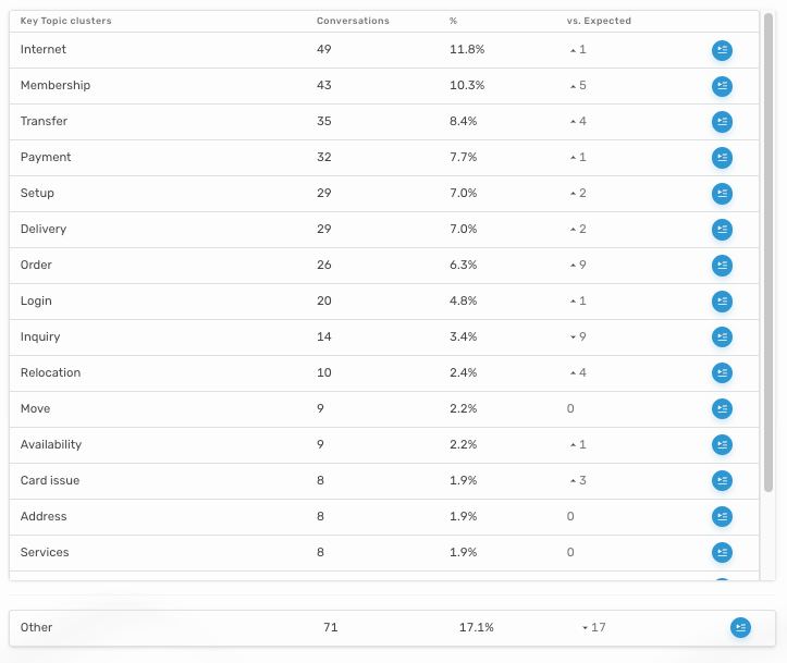
The tabel shows you more data about the individual cluster:
Key topic clusters
Name of the clusterConversations
Number of conversations in clusterPercentage
The percentage of the conversations in the periodOn level 2 it shows both percentage of conversations inside the cluster, and percentage of the total amount of conversations in the selected period.
vs. Expected
Shows if there are more or less conversations in the cluster compared to expected based on the previous 4 weeks.
Capturi will mark clusters with a speaker icon 📣 if the difference is large enough to be statistically significant.

Avg. duration, sentiment and score
Additional information about the conversations in the period.
When selecting a cluster, the info boxes will switch to showing info for the conversations inside that specific cluster and a benchmark to the average of all conversations in the period.

Key topic summary examples
Randomly selected examples of key topic summaries.
Using the filters on the key topics page
Filters can be applied to the key topics page in the same way as you know it from the rest of the platform.
Each time you apply a filter, a new clustering is generated in a few seconds.
This gives you a unique opportunity to get detailed insights on various subsets of data like:
Queues
Conversations with a given NPS interval
Conversations with an significantly longer duration
etc.
Using key topics as filters
All key topics can be applied as filters on the various pages across the platform as well as in dashboards and segments.
